Your site must be accessible to users with disabilities. S&T Sites templates will generally handle most of this for you, but your site content itself must still comply. If you do not use an S&T Site template, you will need to carefully pay attention you follow the required accessibility guidelines. You can read the W3C Web Content Accessibility Guidelines
Links to an external site. for more info, but for most purposes, you should keep the following in mind:
- Your content must work for users with hearing, visual, motor, and other differences.
- Sound is allowed, but sound that is essential to understanding your page’s content is not.
- If sound must be used, it should always be accompanied by an accurate transcript or description.
- Images are allowed, but they must be accompanied with descriptions for users who cannot see them. Use the “Alt Text” input field to describe the image.
- Text may never be embedded in images with graphics software (text in normal photo contexts, like a street sign in the background, is fine).
- Video is allowed, but it should be hosted on a common service (e.g. YouTube) and include closed captioning.
- Custom colors in content should be avoided. The editor will automatically follow brand standards (as long as you’re using a S&T Site template), which are compliant with required contrast. Even if a color looks fine and contrasts well to you, it might not to someone else. You can find our brand colors here if needed.
- Navigation requiring unusually precise pointer control (e.g. links mapped to details in an image) is not allowed.
- Users with visual impairments often rely on screen readers, which in turn rely on the structure of your content. Ensure that your content…
- …has a clear document structure with headings, subheadings (if needed), and paragraph content. These waypoints act as navigation.
- …does not have text embedded in images. Screen readers cannot read the text out of images.
- …does not rely on videos or detailed images to convey its meaning.
- …has a logical navigation structure/content hierarchy that you can imagine without looking at your site to reference.
- …could be understood and navigated if you closed your eyes and only had someone reading it to you.
WCAG 2.0 is a legal requirement for our institution, so any inaccessible content may be removed without warning. In most normal cases you will be notified and provided guidance to update your content to adhere to accessibility guidelines before this removal.
Examples
Text Color
Highlighting text in red to signify importance makes it difficult to read, especially for those with protanomaly, protanopia, or achromatopsia color blindness. The contrast you see may not be the contrast others see. S&T templates generally account for visual conditions and selects colors based on brand standards and legal requirements–do not attempt to override it for aesthetic reasons. If you do not use an S&T Site template, you can use this site to check the contrast.

Graphics with Text
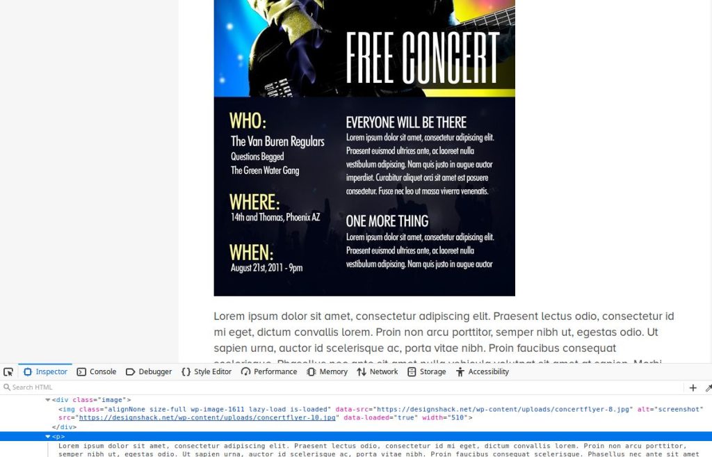
When you embed text in images with graphics software, nothing shows up for blind users. The screen reader can only say that there was an image there; it cannot describe what was in it. Flyers scanned and reposted on webpages are the worst offenders here, followed by slides or banners with text in them. Please find another way to convey your message.

When you see graphics with text on our website in places like the main page, the text is carefully overlaid as a separate entity onto the image in the browser so that it’s still in the document picked up by screen readers. Blind users can still “see” this navigation, but only because these graphics are multi-layered elements designed specially for this purpose–the text is not actually part of the image. Do not attempt this in your own content.

PDFs and Word docs
Please avoid using PDFs and Office documents on the web if at all possible. These file types are rarely ADA-compliant without significant remediation, and are extremely inconvenient to view on mobile devices.
If you are uploading a document that contains only information, create a webpage with that same information instead. You can still link the document to download and print if you like, but always assume that some users will be unwilling or unable to view its contents.
If you are uploading a document that is a printable form, consider instead using Qualtrics Links to an external site. to build a form your users can fill out right on your site. Results can be collected, exported in a variety of formats, and even emailed to you. You can get a Qualtrics account for your site by submitting a ticket at help.mst.edu Links to an external site., and forms are very easy to embed right into any of your pages. You can still print blanks of your Qualtrics forms in case you need offline copies, or you can print responses if your workflow requires keeping physical records.